Artists Foodstuffs
Ana Badia AlzuriaBelén Newman Ortiz
Graphic Elisava 2020
Lots of things tend to happen during a graphic.elisava master’s program. Mountains of research. Maybe one or two existential crises. Designing so much that you have nightmares about mismatched hex codes.
In some weird twist of fate, this year’s biggest ‘thing’ ended up being a global pandemic. We were forced to embrace digitalism over presentialism, do more with less, and channel disillusionment into positivity. In school, the lesson comes before the test, but life often takes the opposite approach. We think we’re better for it.
PLATFORM AND IDENTITY
For this year’s degree show we decided to continue the digitalist lifestyle that we’ve come to know. Pills replace name tags, thumbnails replace handshakes, and ingenuity replaces normality in order to illustrate how we view topics like “design ethics”, “comfort”, “manifestos”, and “freedom”.
About
This is graphic.elisava’s digital Degree Show. Find out more about the program at graphic.elisava.net
Acknowledgements
Many thanks to this year’s students in the Graphic Design and the Editorial Design master’s degrees. The 2020 graphic.elisava Degree Show – both the platform and the campaign that precedes it – wouldn’t have been possible without the indefatigable work of a group of design students making time for it in the middle of their end-of-year presentations.
On the typeface
Thanks to Non Foundry for letting us use their Non®Natural Grotesk throughout the website and campaign of this digital Degree Show.
Visit nonfoundry.com to find out more about their work.


Artists Foodstuffs
A cookbook with a global celebration of the iconic meals the artists survived with.
The most artistic satire of a recipe book.
Today’s food-lovers often travel the globe to enjoy the food of acclaimed chefs. Why do it if you can enjoy Basquiat’s favorite meal at home? Wouldn’t you like to share Van Gogh’s favorite snack with your friends? Do not wait any longer, learn how to cook like your favorite artist.


“Sometimes learning about what an artist ate humanises them, or else it adds to the romanticism and mythology of their lives.”

Sometimes learning about what an artist ate humanises them, or else it adds to the romanticism and mythology of their lives. As Mason Currey writes in “Daily Rituals: How Artists Work” (2013), despite the frequent mention of decadent meals in his memoirs—and the importance of the smell of freshly baked madeleines in “In Search of Lost Time”—Marcel Proust subsisted on a breakfast of black coffee, boiled milk and two croissants in his later years. Ingmar Bergman’s daily lunch of whipped sour milk, strawberry jam and corn flakes was surprisingly jejune. These habitual, uninspiring meals seem unlikely fuel for creative work.
Underpinning this genre of books is the fact that food and art are both shared experiences, shaped by wider cultural histories. The effect of a delicious meal is in many ways the same as a viewing an exquisite painting: it creates an appetite for more.
— The Economist
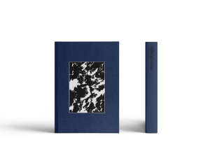
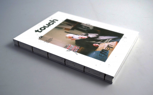
It is a light-hearted, punk-style book about recipes of 50 artists’ favorite dishes. As seen in the images, it is a small format, difficult to open —as opposed to a traditional recipe book— it is all in black and white, when the images in the recipe books are usually vivid, with lots of color. We could say that Artists Foodstuffs is the anti recipe book. In the same way, continuing with the carefree character that we wanted to convey with the publication, we decided on a carefree binding, with industrial staples and exposed spine.
Artists Foodstuffs is primarily made of four parts.
The first, the introduction, is made of two parts. First, the utensils and elements necessary to follow the recipes are shown; accompanied by a text that invites you to cook and follow the recipes. Then we added the classic conversion charts, cooking tip lists, and more basic cooking definitions that often appear in all recipe books to help the reader. And for this, the pages of a traditional cookbook were scanned to make the connection with a traditional book.
The second part is the main body of the publication: the recipes. As can be seen in the images, it has a casual, handwritten design, each sheet is different and it seems that everything is messy. The images breathe a homey air, with the aim of bringing us closer to the reader; extremely realistic and with the use of flash in many cases. The objective is to humanize the artists by showing their recipes in the most daily, casual, and homemade way possible. In addition, being a satire from a recipe book, humor is used, both in texts and in compositions, to convey the desired tone.
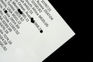
The third part, located within the second, that is, in the central pages of the publication, corresponds to the actual recipes for each of the dishes. They are completely typographical yellow pages. We decided on this format and this design because the intention was that they would evoke a phone book —which was considered to be somewhat awkward to read. But while still being a recipe book, if someone wants to cook them, they have to be able to.
Finally, to sum up, an existing scanned book. This is a photography book by the photographer Paige Powell, Artists Eating, where she shows artists eating in a completely “eccentric” environment. These pages serve to transport the reader into the world of the artists. Those pictures are the demand for the reader to cook the artists’ dishes, to make the readers feel like artists.


