Once Upon a Time The End
Belén Newman OrtizAna Badia Alzuria
Graphic Elisava 2020
Lots of things tend to happen during a graphic.elisava master’s program. Mountains of research. Maybe one or two existential crises. Designing so much that you have nightmares about mismatched hex codes.
In some weird twist of fate, this year’s biggest ‘thing’ ended up being a global pandemic. We were forced to embrace digitalism over presentialism, do more with less, and channel disillusionment into positivity. In school, the lesson comes before the test, but life often takes the opposite approach. We think we’re better for it.
PLATFORM AND IDENTITY
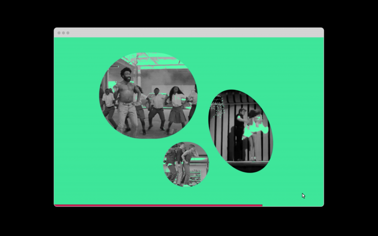
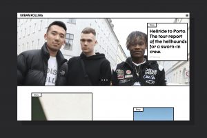
For this year’s degree show we decided to continue the digitalist lifestyle that we’ve come to know. Pills replace name tags, thumbnails replace handshakes, and ingenuity replaces normality in order to illustrate how we view topics like “design ethics”, “comfort”, “manifestos”, and “freedom”.
About
This is graphic.elisava’s digital Degree Show. Find out more about the program at graphic.elisava.net
Acknowledgements
Many thanks to this year’s students in the Graphic Design and the Editorial Design master’s degrees. The 2020 graphic.elisava Degree Show – both the platform and the campaign that precedes it – wouldn’t have been possible without the indefatigable work of a group of design students making time for it in the middle of their end-of-year presentations.
On the typeface
Thanks to Non Foundry for letting us use their Non®Natural Grotesk throughout the website and campaign of this digital Degree Show.
Visit nonfoundry.com to find out more about their work.


Once Upon a Time The End
Cronology of the Apocalypse
This civilization is over and everybody seems to enjoy it.
Panic is a constant in the history of humanity.
From the beginning of the earliest writings, such as the book of Daniel (a biblical book B.C.) to the series we see today, they teach us various ways of how we are going to die.
In fact we are the only species on earth that knows it is going to die. While this is happening, we are in the first seats with popcorn waiting for him and as a group we do not put definitive remedies.
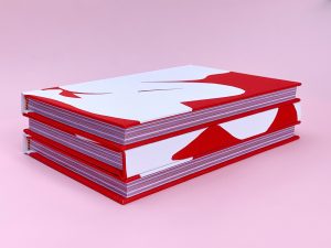
It is a book with the chronology of all the predictions of Revelation that have existed until today. We want to investigate the social effects that have occurred after these predictions. See how they have affected the population. They can be artistic, scientific, literature, collective consequences, etc.
We propose to explore how these apocalypses have evolved, depending on the times when predictions were made.


We seek to raise awareness of the gravity of the moment we are in. And we want to insist on the fact that although historically it has been seen as entertainment, it is not.

Verticality represent “the unity between divinity and power”
We wanted it to be very vertical, like The Prophecies of Nostradamus (which is one of our conceptual references). And that the same verticality was also transmitted in the inner pages.
We use only one font: Practice by Óptimo. An elegant typeface that offers a clear reading with a contemporary aesthetic. And very versatile, and allows it to be used for different text hierarchies.
As we see, each Apocalypse is accompanied by a title, a quick description of the Apocalypse, the context that surrounds it and the corresponding images.
The treatment of images from the past is always in black and white, since they are archival images, and it also allows us to unify.
And since it is a very long book and to avoid it being monotonous, we decided to incorporate several breaks, pauses between the story, to make the reading more enjoyable.
